
About MFS Design and Creative Direction for all projects: Gilberto Pocaterra Read More
With the help of a brand consultancy firm, MFS repositioned the brand to underscore a unique collaborative process that generates invaluable homegrown expertise. A conservative logo was replaced with a vibrant symbol (designed by Lippincott Chicago) that became the visual catalyst that helped transform how the company portrays itself.
MFS corporate meetings go all on brand
Solution: Sub brands – rarely substantial enough to convey fully rendered ideas – were replaced with a flexible, but singular approach supporting the umbrella brand. Customizable templates provide the flexibility required to reinforce the individuality of each meeting.


 1
1 2
2 3
3 4
4 5
5


 1
1 2
2 3
3 4
4 5
5Going local with international client meetings
Read More
Solution: The colors of the hosting country’s flag and photos of local architecture provides the elements to quickly tailor each meeting. A corporate-colors alternative is used for multi-country events. Pre-approved templates allow meeting support materials to come together quickly without the need to present design alternatives.


 1
1 2
2 3
3 4
4 5
5 6
6 7
7 8
8Creating face-to-face opportunities — Fixed Income Capabilities campaign
Read More Original photography: Jason Grow
Solution: Effective marketing campaigns are all about customer interactions. Brochures are another way to interact with customers and generate leads. Printed pieces make excellent openings to a conversation or as leave-behinds. This brochure, part of the Fixed Income Campaign, works well in print or as a downloadable pdf. Each spread was also shared via social media and posted on financial blogs.


 1
1 2
2 3
3Saving time with automation — performance materials
Read More
Solution: The suite of performance material includes automated and semi automated templates that complement each other and follow the same core guidelines. All publications showcase the company’s creative vision and advance the MFS brand.


 1
1 2
2 3
3Delivering a unified email platform
Read More
Solution: A unified email platform that delivers dynamic and relevant experiences by connecting brand and content to drive a deeper engagement. Responsive templates and a modular design approach allow each email to present multiple topics while remaining scanable and mobile-friendly. Color-coded content buckets give content creators creative guardrails that maintain the integrity and consistency of the brand.


 1
1 2
2 3
3Cultivating the MFS brand internally
Read More
Solution: Implementation of a system that acknowledges the nature of some lighthearted events but is also consistent with the brand voice and aesthetic; helping every employee personally identify with the brand. Every touch-point is an opportunity to help employees get behind the MFS brand. “Take me 2 Work” (TM2W) logo, the Collaboration Award, and the “Golden Era of Hollywood” holiday party, are three examples of internal branding opportunities.

Staying in touch with clients — MFS holiday card
Read More
Solution: Logo-inspired typography was designed to reinforce the brand. Signed cards were mailed to top clients and suppliers while a digital version was created for wider distribution. The digital card introduces twinkling stars to transmit feelings of joy and celebration.


 1
1 2
2 3
3MFS Beyond the logo — value-added services
Read More
Solution: 17 postcard invitations on editable pdf format that Advisors can customize and print through mfs.com or at their local print shop. Broker-only pieces and the microsite followed brand guidelines.
PRE-REBRAND MFS WORK
Read More Read More
Re-engaging satisfied clients with direct mail
Solution: To re-engage top brokers in the 401(k) business, MFS developed the “get rolling” campaign. The “desktop” toy was a simple solution to keep the MFS name and phone number handy. The box got noticed in the mailroom and got a high OPEN rate. A flat postcard with noise chip was created for wider distribution.
Designer: Gilberto Pocaterra, Creative Director: John Luiz
_closed3")
_open3")
 1
1 2
2
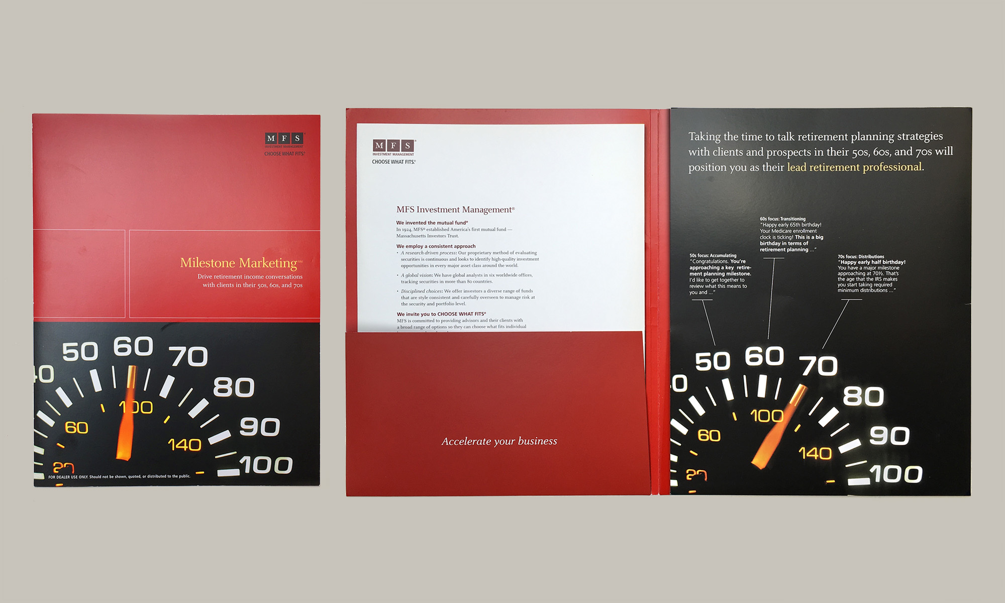
Helping brokers accelerate their retirement business – Milestone Marketing
Read More
Solution: A multi channel solution approach was proposed, with emphasis on printed material that brokers could use on face-to-face meetings with their clients. The tagline “Accelerate your business” and the odometer literally speaks to brokers wanting to grow their business by targeting clients nearing or at retirement. A companion website included broker-only information and downloadable PDFs for all the clients’ materials.
Designer: Gilberto Pocaterra, Creative Director: John Luiz